Visual Hierarchy in Web Design for UX
When visitors open your website, the visual hierarchy acts as the silent guide that directs their eyes to what is most important. In a world where the average attention span is getting shorter, a clear structure determines whether a visitor stays or leaves.
At Ideal Design, we know that a well-thought-out visual hierarchy not only improves the user experience but also directly contributes to your business goals. Your website should not only be beautiful but also strategically designed to drive conversions.
In this article, we explain what visual hierarchy exactly entails, why it is crucial for every business, and how you can use it to strengthen your online presence.
What Is Visual Hierarchy And Why Is It Important?
Simply put, visual hierarchy is the arrangement of elements on a page so that the user's eye follows a logical path. It determines which information is noticed first, what is secondary, and what remains subordinate. Without a good hierarchy, a visitor quickly becomes overwhelmed and leaves your site.
Why is this so important? Because the first impression of a website is formed within seconds. If the visual hierarchy is missing, users don't know where to look. A poor experience leads to higher bounce rates and missed opportunities. At Ideal Design, we use proven principles to intuitively guide your visitors to your most important actions – such as requesting a quote, buying a product, or getting in touch.
- A clear hierarchy increases the readability and scannability of your content.
- It strengthens your brand message through consistency in typography and color use.
- It supports your conversion goals by drawing attention to call‑to‑actions.
That is why visual hierarchy is not a luxury, but an absolute necessity for every professional website. We apply these principles in every web design project, from landing pages to extensive e‑commerce environments.
The Building Blocks Of An Effective Visual Hierarchy
A strong visual hierarchy rests on a number of solid pillars. Each element plays a role in directing attention and creating a natural flow. Below, we explain the most important building blocks.
Size and scale – Larger elements attract attention first. By making your main message or CTA larger, you give it immediate priority. Headings and subheadings should clearly differ in size from the body text.
Color and contrast – Bright or contrasting colors stand out. Use accent colors strategically to highlight action buttons. A calm color palette in the background keeps the focus on the most important elements.
Space and white space – Sufficient white space around items prevents visual clutter. It gives the page breathing room and helps the user process information in chunks. White space is not a waste, but a powerful hierarchical tool.
Hierarchy in typography – Use different font sizes, weights, and styles (bold, italic) to indicate a clear order. A well-chosen font family with sufficient contrast between heading and body improves readability.
“By cleverly using size, color, and white space, we can direct attention exactly where you want it – whether that's a contact form, a product image, or an important USP.” – Team Ideal Design
All these elements together form a cohesive system that effortlessly guides users through your website. Our designers continuously test and refine this system for optimal results.
How Visual Hierarchy Increases Your Conversion
An attractive design is nice, but the main goal is conversion. Visual hierarchy plays a central role in this. When visitors immediately see what the next step is – for example, “Request a free quote” – the chance that they will take that step increases.
We optimize your landing pages by aligning the hierarchy with your conversion goals. That means: placing the most important CTA prominently, positioning supporting elements such as testimonials or guarantees around it, and minimizing distractions. A clear visual hierarchy can increase the number of conversions by tens of percent.
- Lead generation: a form or button must be findable at a glance.
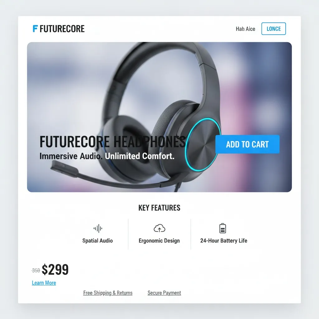
- E‑commerce: product images, price, and “Add to cart” must visually stand out.
- Services: heading with service name, benefits, and a clear CTA.
Through user research and A/B testing, we determine which hierarchy works best for your target audience. We combine this with chatbot integrations and image optimization to make the entire user journey seamless. The result? A website that not only looks beautiful but also measurably delivers more.
You don't have to wait until you have a completely new website built. Even with targeted adjustments, you can improve the visual hierarchy. Here are some tips you can apply immediately.
1. Determine one primary action per page – What should the user do? A page with multiple equally prominent buttons is confusing. Give one clear CTA the most visual emphasis.
2. Scan your page as a user – Look at your screen and note what stands out first. Is that the information you want to convey? If not, adjust the size, color, or position.
3. Keep it simple – Less is more. Limit the number of colors, fonts, and visual elements. A minimalist approach strengthens the hierarchy and improves loading time.
4. Use visual cues – Arrows, icons, and subtle animations can direct attention. Think of an arrow next to “Read more” or a moving button that invites clicking.
At Ideal Design, we offer a free user research to identify the weak points in your current website. Our specialists look at the flow, the hierarchy, and the conversion points, and provide concrete improvement suggestions.
Frequently Asked Questions About Visual Hierarchy
What Is The Importance Of Visual Hierarchy For My Website?
Visual hierarchy determines how easily visitors find information and take action. A good hierarchy increases the user experience, lowers the bounce rate, and increases conversion. Without hierarchy, the message gets lost in a sea of elements.
How Does Ideal Design Apply Visual Hierarchy In Projects?
We start with an analysis of your goals and target audience. Then we design wireframes in which the hierarchy is established. During the design phase, we test multiple variants for clarity and effectiveness. Our approach combines theory with practice, so every pixel adds value.
Can I Improve My Existing Website In Terms Of Visual Hierarchy?
Absolutely. Often, small adjustments are enough for a big effect. Think of repositioning buttons, increasing contrast, or adding white space. We perform a quick scan and give you a list of priorities. A cheap optimization can significantly improve performance.
How Long Does It Take To Design A Website With Optimal Visual Hierarchy?
That depends on the complexity. For a landing page, it can take a few days; for a full e‑commerce site, several weeks. We always schedule enough time for testing and fine-tuning, because the perfect hierarchy is not created in one go. Ultimately, this results in a robust design that lasts for years.
At Ideal Design, we believe that a well-thought-out visual hierarchy is the foundation of every successful website. Whether you want to have a professional website built, optimize your existing site, or invest in conversion optimization – our team is ready for you. Contact us today without obligation and discover how we can strengthen your online visibility and revenue. Your users are waiting for a clear guide; give them one with the right visual hierarchy.
